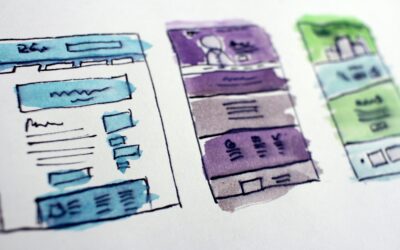
Your heart is racing, your eyes dart around the room, and you feel your palms getting clammy – is it a monster? No! It’s a website so scary it’s driving all your customers away!
Building a website can be complicated, and there are plenty of website mistakes that can quickly leave your site as empty and abandoned as that dark, foreboding house at the end of the street. Here are five common errors businesses make when developing their site and a few tips on how to avoid them.
As you venture down this list, be warned – these Website Killers are right behind you!
1. A Terrifying User Experience
An important goal of your website is to keep users around. The last thing you want is for potential customers to “bounce off” your site immediately after opening it because the site leaves a bad first impression. If you have slow loading times, confusing site navigation, or a basic and uninteresting web design, these all hurt the user experience and encourage people to leave your site as quickly as possible.
Focus on creating a website that hooks users right away and feels good to use. Compress images to speed your site up, format everything to be mobile-friendly, and design your pages in a way that’s visually compelling while also being easy to understand and navigate. Make browsing your website a treat, not a frustrating trick.
2. Letting Ghouls and Goblins into Your Site
You don’t have to be afraid of slashers and ghosts on the internet, but you do have to worry about viruses and malware (when will we get a horror movie about my stolen debit card information?). Now, more than ever, security and privacy on the web are of utmost importance to your customers. When they visit your site, they should be able to confidently browse every page without worrying about whether it is safe or not. In fact, if you haven’t secured your site with an SSL or TSL certificate, users may get a warning before they visit your site saying that it’s not safe! That’s a great way to keep people away from your business.
Upgrading your website’s basic security establishes trust and authority with site visitors and ensures their data (and yours) is protected while they browse.
3. A Mystifying “About” Page
Customers come to your website looking for information. One of the worst website mistakes you can make is hiding that information behind a frustrating and difficult-to-parse “About” page. For starters, it should be easy to find and navigate. First-time visitors may not even scroll your home page but instead immediately look for a company bio or “About Us” content. They shouldn’t have to spend a ton of time searching for it.
Once they navigate the page, nothing is worse than finding a bland, generic block of text that fails to connect or inform. Make sure your bio page is engaging and informative by spicing it up with pictures, personality, and first-person perspective. No one knows your business better than you, so you should speak to your customers in your voice, not with bland business fluff.
4. Shocking Content Errors
You want to build trust with current customers and first-time website visitors. Your site should establish your authority in your niche and your competence as an industry professional. Nothing sours that trust more than egregious spelling and formatting mistakes on your site. Why should your customers trust your attention to detail if there’s no hyperlink where it says “Click Here!” or if your latest blog post wishes everyone a “Hapoy Halloweeny”?
Making sure your site is free of these kinds of typographical errors is Website 101. These website mistakes are easy to overlook if you’re not careful, but also very easy to avoid if you review all your website copy with a fine-tooth comb before (and after) publishing.
5. Content that Feels Like a Trap
It’s crucial to drive traffic to your site, but you should get visitors who want to be there, not ones who have been hoodwinked into clicking a link. Gaming the search engine algorithm with low-quality content built on keyword spamming and buying backlinks won’t earn you any love from potential customers (and won’t get you good SEO results anyway).
Instead, focus on building a catalog of content that adds value for your customers and sets your site up as an authoritative, reliable source in your industry niche. That will gain you trusting customers who stay on your site because they enjoy your content, which will help you build a positive reputation.
Build a Website, Not a Haunted House
Website mistakes like the ones above are great if you want to frighten your visitors but not so great if you want to convert them into loyal customers. However, those are just a few of the many pitfalls businesses fall into when trying to build an engaging website. At GreenCup, we’re here to help you avoid those haunting mistakes. Download our Website Health Checklist to make sure your site is free of digital nightmares, and connect with us to see why there’s no need to be scared of the dark (web)!


